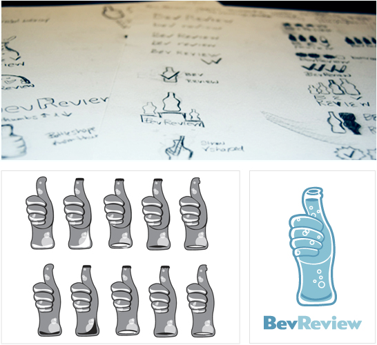
 We’re covering a very familiar topic — the design process. We went back and forth answering each other’s questions, describing the process for our last project at Hexanine, a logo for BevReview. Think of it as the teaser before the big reveal of the final design. Brigid and I each took turns asking the other questions, and responding in turn. Read on to find out what our process was and what we learned along the way.
Can you explain the brief for this project?
Chris: BevReview is a beverage blog ran by Steve Tanner. His blog discusses everything from taste and nutrition facts, to the packaging of the drinks. All of the BevReview posts focus on non-alcoholic beverages. Brigid and I took on the task to create a logo that shows BevReview as a fun and credible resource in the beverage industry. The goal was to give BevReview a logo that will stay true to it’s brand.
Would you like to talk about what kind or research we did for the project?
Brigid: I researched the company, industry, and their competitors to find out who they are and their target audience. From our initial meeting with BevReview, I was handed the task of focusing on the concept of rating. So, I began by writing words that could be used to describe or symbolize rating, such as, checks, thumbs up and down, scale, arrows, ranking using bottles or caps, etc.


