After six amazing years, the founders of Hexanine have moved on to other independent design work and creative endeavors. Read more

Hexanine

  • Work:

  • All
  • Identity
  • Print
  • Packaging
  • Web
  • About
  • Book
  • Blog

Zeroside

Concrete brand talk in an ephemeral world
  • Authors

    Zeroside is the brainchild of Tim Lapetino and Jason Adam, partners of brand design firm Hexanine.

    This is our place for conversation on the issues and curiosities of graphic design and branding.

  • Categories

    • Announcements
    • Brand Manifestations
    • Branding
    • Case Study
    • For Clients
    • Interview
    • Lies About Clients
    • Musings
    • New Work
    • News
    • Obsessions
    • Recommended
    • Special Offer
    • Student Spotlight
    • Tales from the Interns
    • This week's thoughts
    • Tool Tip
    • Uncategorized
  • Subscribe

    Receive our email digest.

  • Follow us


    Follow @hexanine
  • Recent Tweets

    • Identity Branding Stationery PSD Mockup http://t.co/Q23zslZgp3 Oct 19, 10:02 am from Twitter Web Client
    • Holy Yoko Ono! After 6 yrs, @Hexanine breaking up the band, w/ @lapetino & @JasonAdam moving on 2 new things. http://t.co/eijtPuP9eq Jan 8, 5:40 pm from Twitter Web Client
    • Vote & help our friends @twobitcircus win $100K @LA2050 grant 4 @STEAMCarnival, their fun learning project 4 kids: http://t.co/pEbp87b1sL Sep 10, 9:55 am from Hootsuite
  • Recommended

    • A List Apart
    • AIGA Chicago
    • AIGA Los Angeles
    • Authentic Boredom
    • Brand New
    • Debbie Millman
    • Design Observer
    • EPIC
    • FPO: For Print Only
    • ideasonideas
    • Igor: Naming Blog
    • Processed Identity
    • Quipsologies
    • Studio on Fire: Beast Pieces
    • Typophile
    • Zeldman
  • Tags

    AIGA AIGA Chicago AIGA LA art atari book design brand identity branding brands brand strategy business chicago portfolio school clients creativity design design business design education design thinking Golden Apple Foundation graphic design hexanine HOW how design HOW Design Live iam8bit identity identity design inspiration Jason Adam logo logo design logos Los Angeles musings package design plastic highway portfolio print print design printing publishing redesign strategy Tim Lapetino video games

Now viewing all posts tagged logo
« Older Posts

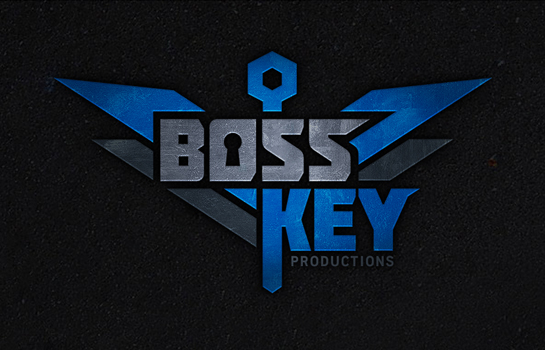
New Boss Key Productions Logo Leaked

Hexanine Boss Key Logo

Over the holiday weekend, word leaked that video game industry rock star Cliff Bleszinski (lead designer of the Gears of War franchise) is launching a new studio, Boss Key Productions. The brand new identity we created for Boss Key also found its way into the daylight as well.

But now it’s officially live, and we’re excited to show the world – just a prelude to the amazing things Boss Key has in store for gamers.

  • Posted by Tim Lapetino
  • Filed under Announcements, New Work, News

Jul 7 2014

Tagged:
Boss Key, Boss Key productions, Cliff Bleszinski, CliffyB, FPS, identity design, logo, logo design, video games

10 Comments

Our Work Included in LogoLounge Master Library Book 4

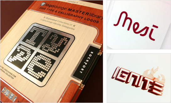
Hexanine work in LogoLounge Master Library Book 4

We always mention how much we love the LogoLounge wesbite and book series. So, it’s always a great honor for us to have our work included in another volume of the excellent and popular series. Some of our conceptual work for Mesí and final identity for Ignite are included in this volume.

  • Posted by Tim Lapetino
  • Filed under Announcements, News

Jul 5 2012

Tagged:
branding, identity, Ignite, logo, Logolounge, LogoLounge Master Library Book 4, Mesí, work

Comment

Netflix = A Widescreen Brand Disaster?

Netflix Brand Disaster

Like a plot twist gone astray, the streaming film company, Netflix, has once again befuddled customers by reversing course with a recent brand announcement. Weeks ago, Netflix announced its intention to divide its streaming and physical mail business units into two separate entities, while simultaneously apologizing for recent price hikes. This effort was intended to kick off the renamed DVD mail service, christening it Qwikster. Apparently, public outcry and common sense won the day, as Netflix backtracked and rejiggered its plans.

This on-again, off-again game of brand Twister has damaged the Netflix name and its brand cache. While we can only guess at the business reasons that motivated these decisions, it’s plain to see how Netflix shot itself in the foot from a brand perspective.

Read on…

  • Posted by Tim Lapetino
  • Filed under Case Study, For Clients, Musings, Recommended

Oct 30 2011

Tagged:
brand identity, branding, corporate identity, logo, logo design, netflix, qwikster, renaming, wide screen disaster

2 Comments

Student Spotlight: Criterion and Barnes & Noble

At Hexanine, we believe it’s important to help nurture the next generation of designers, and that’s why we’re involved in mentorship and teaching. Also, we benefit from brushing up against the passion and growth of young designers, and find we get almost as much out of the experience as our students. To that end, we also like to occasionally showcase the standout work of our students here at our blog.

So, as part of Tim’s Brand Standards and Identity class at Chicago Portfolio School, here are identity redesign projects from two students, Diane Johns and Megan King.

Megan has redesigned the logo for the DVD/Blu-Ray publishers, Criterion. She’s done a great job customizing and streamlining an existing typeface for wordmark use, and subtly works in the traditional “widescreen” proportions as part of her mark.
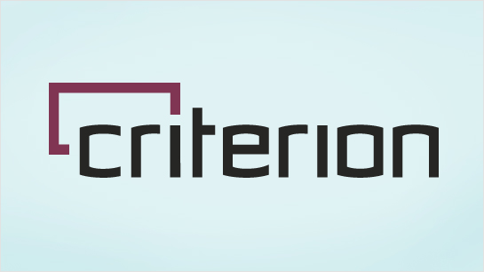
Megan King Criterion Logo Redesign

And Diane has reimagined Barnes & Noble with her own redesign. This clever mark is cobbled together from typographic punctuation, with an approachable, offbeat style for 21st century reading.

Diane Johns Barnes and Noble Logo Redesign

Great work all the way around, ladies!
  • Posted by Tim Lapetino
  • Filed under Recommended, Student Spotlight

Sep 26 2011

Tagged:
barnes and noble, brand identity, brand standards, branding, chicago portfolio school, class, classroom, Criterion, diane johns, education, identity, logo, logo design, megan king, redesign, student spotlight, student work, students

Comment

When is it Time For a Rebranding?

When is it time for a rebranding?

Logos and brand identity are an oft-misunderstood part of design. A logo is not a brand. A logo is not a brand identity. A logo is a crucial part of an overall brand identity, but it’s just one part of a larger toolbox that contains things like color palettes, brand platforms, photo styles, graphic patterns, positioning statements, and much, much more. This is well-traveled territory. But one thing that’s rarely discussed in logo and identity circles is timing. For clients, when is it a good time to rebrand your organization?

It depends on who you ask, but there are a lot of avenues where it makes sense to initiate a logo redesign. Many prospects and clients see identity design only as a first-stage project — to be initiated early in an organization’s life cycle — for startups and newly-minted organizations. But truly, a new identity is valuable for all seasons. If executed thoughtfully and properly, a redesign is a powerful weapon that can have maximum impact across a variety of moments during the life of your brand.

Read on…

  • Posted by Tim Lapetino
  • Filed under For Clients, Musings, Recommended

Aug 5 2011

Tagged:
funding, identity, logo, logo design, rebranding, redesign, repositioning, strategy, time

1 Comment

New Work For iam8bit Posted

iam8bit identity redesign

We’ve just added some work to our portfolio — the redesigned identity of our client and partners, iam8bit. Take a look at the link for more details.

  • Posted by Tim Lapetino
  • Filed under Announcements, News, Recommended

Apr 20 2011

Tagged:
iam8bit, identity, identity design, logo, portfolio, redesign, video games

Comment

The Future Is Fluid: Inside Dynamic Logos

Fluid Identities and Logos

During the research phase of a recent identity project, we spent some time revisiting numerous examples of what we like to call “fluid identities” — logo systems that use multiple iterations of a mark (or series of marks) to communicate a particular aspect of a brand. These might take the form of a logo that changes with each viewing, or a singular mark that gets impregnated with different imagery, depending on the context. At one point, these types of projects were few and far between, but now these isolated examples have grown into a full-blown trend. The days of the static logo are certainly not extinct, but this persistent way of thinking about malleable identities seems like a portend of things to come.

Read on…

  • Posted by Tim Lapetino
  • Filed under Case Study, Musings, Obsessions, Recommended

Mar 9 2011

Tagged:
Alan Goodman, Alexis Rom Estudio, AOL, brand identity, Casa da Musica, Droga 5, E Roon Kang, fluid identity, fluid logos, Get Up Hair, Heydays, ITI, Knopf, Knopf Borzoi, logo, MIT Media Lab, MML, mobile media lab, MTV, Museum of Arts and Design, Neu Design, New Museum NY, New York, Nickelodeon, Nodkyn, NYC Inc. Company, Omnivore, Pentagram, PWC, Richard The, Sagmeister, Scott Nash, SECCA, Stefan Sagmeister, Tom Corey, Wolff Olins

266 Comments

Damn Good Call For Entries Deadline Extended to Feb 28

We’ve received lots of great work from the call for entries for our upcoming book, Damn Good: Top Designers Discuss Their All-Time Favorite Projects. But we’re not finished yet! We want to give you one last chance to enter your work in identity, print, web, packaging, illustration and axed projects, so we’re extending the deadline. The final, drop-dead date for submitting your work at our partner site is February 28th, 2011. So, if you’ve missed the initial entry window, now’s the time to get your work in. More details about entry and the book itself can be found in our earlier blog post. Damn Good will be released by HOW Design Books this coming November.


  • Posted by Tim Lapetino
  • Filed under Announcements, News

Feb 15 2011

Tagged:
axed projects, call for entries, crescent hill books, damn, damn good, damn im good, design entries, how design, how design books, killed projects, logo, logo design, online submission, package design, print design, website

3 Comments

New Green Energy Reporter Site Launched

The redesigned website for Green Energy Reporter is now live. You can visit the new site itself, and read more about its creation on the Hexanine site.

  • Posted by Tim Lapetino
  • Filed under Announcements, News

Feb 2 2011

Tagged:
branding, green, green energy, green energy reporter, identity, identity design, logo, online news, redesign, reporting, strategic design, web design, website design

Comment

Show Off Some ‘Damn Good’ Work

Update: The Damn Good call for entries deadline has been extended to Monday, February 28th, 2011. More info here.

We are super excited to announce the official call for entries to our upcoming book, Damn Good: Top Designers Discuss Their All-Time Favorite Projects. Hexanine has partnered with HOW Design Books and Crescent Hill Books to deliver this design inspiration book, our very first!

Read on…

  • Posted by Tim Lapetino
  • Filed under Announcements, News, Recommended

Jan 21 2011

Tagged:
axed projects, call for entries, crescent hill books, damn, damn im good, design entries, how design, how design books, killed projects, logo, logo design, online submission, package design, print design, website

1 Comment

« Older Entries

Zeroside is Powered by WordPress  |  Entries (RSS) and Comments (RSS)

©2023 Hexanine  |  Los Angeles 323-977-9195  |  Chicago 773-678-9951  |