Our Work Wins An FPO Award

FPO Award for Hexanine

This news has already been announced, but we are sufficiently humbled and honored enough to talk about it in this space too. We’re excited to mention that our work for AIGA Chicago and Unisource on the AIGA Voices piece has been chosen as an FPO Award winner! The FPO Awards are an outgrowth of the design and production blog, FPO, run by Armin Vit and Bryony Gomez-Palacio of UnderConsideration. FPO and the rest of the “blog family” created by UnderConsideration have been favorites of ours for many years. We’re thrilled to be chosen in this year’s FPO Awards, and look forward to seeing all of the other winners in the upcoming printed book.
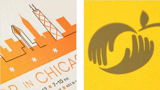
New work: Gruppo Cordenons and Golden Apple

New work: Gruppo Cordenons and Golden Apple Foundation

We’re continuing to post new work, so here are more of the projects we’re bringing out from behind the curtain. These are event and invitation design work for fine paper maker Gruppo Cordenons, as well as a direct mail campaign for local Chicago nonprofit, Golden Apple Foundation. Click for more details on the fruits of these great client partnerships.

Behind The Design: Our SUPER iam8bit Book

We’re wrapping up the production on a book we’ve designed called “SUPER iam8bit: More Art Inspired By Classic Video Games of the ’80s.” The book was written by our partners at iam8bit. Hexanine designed the entire volume, from cover to cover, and we’re also co-publishing it under our new Plastic Highway imprint.

While the book won’t be officially released until next month, here are some fun moments we’ve had during the process:

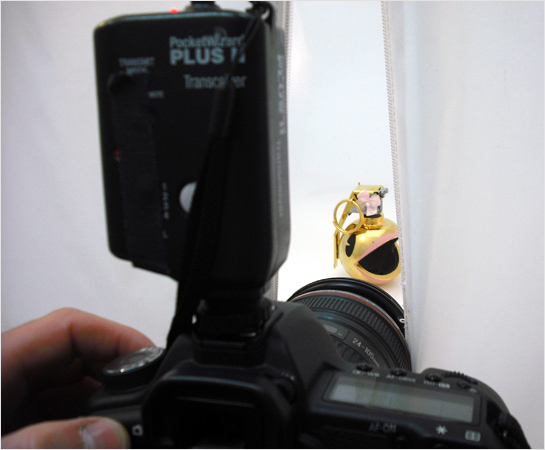
Super iam8bit cover shoot

Read on…

iam8bit Collateral Added To Portfolio

iam8bit Stationary

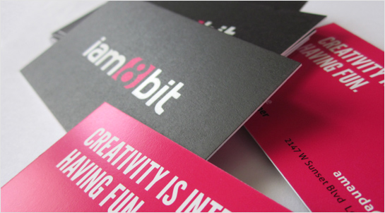
Our print collateral work for iam8bit is now up in our portfolio, so take a look.

New Prominic.NET Print Work Added

We’ve just added our latest print piece for Prominic.NET to the Hexanine portfolio. Check the link to read more about the work and Prominic, one of our oldest clients.

Color My World: A Designer’s Guide To Pantone, Part 2

Color My World: A Designer's Guide To Pantone Part 2: Plus

Note: In our last installment we walked through the release of Pantone’s Goe system, and the lessons learned from that product’s lackluster launch. Those insights fed directly into changes to the Pantone Matching System (PMS) that culminated in this year’s launch of Pantone Plus. Now, we’ll dig into the details of the this brand new system, and what it means for designers, printers, and anyone else involved in laying ink on paper.

Read on…

Color My World: A Designer’s Guide To Pantone, Part 1

Color My World: A Designer's Guide To Pantone Part 1: Goe

What is Pantone?
If you’ve ever held color-printed piece in your hands, there’s a good chance you’ve been touched by Pantone. The self-described “authority on color”, Pantone has become an integral part of graphic design and printing, greatly influencing the color of our world. Since 1963, Pantone has been the force behind the printing industry’s color standard, the Pantone Matching System (PMS). PMS is a standardized color reproduction system whereby different manufacturers and printers can accurately reproduce the same set of colors without direct contact with one another. This is significant for brands, because of the importance that consistent color reproduction has on brand identity and packaging. Color plays such a crucial role in brand association that some companies even commission their own colors. (Tiffany’s, well-known for its signature teal blue, actually has its own custom, trademarked Pantone color, PMS 1837.)

Read on…