What is Pantone?
If you’ve ever held color-printed piece in your hands, there’s a good chance you’ve been touched by Pantone. The self-described “authority on color”, Pantone has become an integral part of graphic design and printing, greatly influencing the color of our world. Since 1963, Pantone has been the force behind the printing industry’s color standard, the Pantone Matching System (PMS). PMS is a standardized color reproduction system whereby different manufacturers and printers can accurately reproduce the same set of colors without direct contact with one another. This is significant for brands, because of the importance that consistent color reproduction has on brand identity and packaging. Color plays such a crucial role in brand association that some companies even commission their own colors. (Tiffany’s, well-known for its signature teal blue, actually has its own custom, trademarked Pantone color, PMS 1837.)
In the last 40 years, Pantone has become the de-facto print color standard by eclipsing its competitors and evolving into other arenas. But despite Pantone’s ubiquitous presence in the drawers of any self-respecting designer, and its use in all major design software, the company has recently made some significant product line changes—changes which are important to anyone who needs to select or print colors. We’re hoping to break down these changes and give designers, printers, and color aficionados some much-needed insight. In our first installment, we’ll discuss Pantone’s Goe ink system. And then, in part two, we’ll give you the latest on Pantone’s brand-new replacement for the PMS, called Pantone Plus.
We got the inside scoop from Pantone while talking with Giovanni Marra, Pantone’s Director of Corporate Marketing. To add a more diverse set of views, we also interviewed a select group of offset printers (Elk Grove Graphics, Darwill Press, Van Lanen and Lithographix) and ink manufacturers (Sinclair Ink Systems) to get their input.
Get Up And Goe Got Up And Went
After nearly 50 years, Pantone decided it was time for a change, and it did so with some fanfare, by launching a brand new color matching system, called Goe (and pronounced “go”). But what was the impetus for this launch?

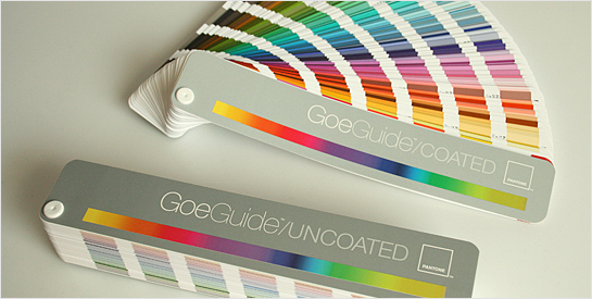
Giovanni Marra said, “Over the years we have added colors, because designers always want more colors to choose from. The [swatch]books turned into a haphazard arrangement of colors, because we would always add new colors onto back of the book. It was easier because of mathematical numbering, but not intuitive. In 2007, were looking at how to upgrade the system, and integrate the features people were asking for. After a lot of research, we came out with Goe. It was laid out scientifically, in chromatic arrangement, with easy steps between colors, making it easy to find colors and work through the book,” Marra explained.
The Goe system yielded 2,058 colors, a system that could work alongside the original PMS, as well as features intended as benefits for printers. The Goe system uses 10 base inks instead of PMS’ traditional 14, which was less total inks, but still a completely new set of inks for printers to purchase. These new base inks allow for an expanded color gamut, and Marra explained Pantone’s intentions in using the new base inks: “With Goe we tried to make the system more easily printed,” he said, “because some colors can shift if they are coated certain ways. Most printers know how to get around these issues, but we wanted to fix them. We had to change some of the ink bases to deal with these coating issues.” For both designers and printers, employing the Goe system meant adapting to an entirely new numbering system as well, a huge change from the nearly-sacred numbering system of the traditional PMS. This change wasn’t received very well.
Why Goe Didn’t Take Off
Goe was launched with good intentions, but didn’t yield the results Pantone hoped for. “It never took off the way we thought it would,” Marra mentioned, “because people are very comfortable using the PMS system, and in general were very resistant to changing.” Right off the bat, the Pantone marketing was confusing. From the designers’ side, it wasn’t clear how Goe would relate to its older brother, the storied PMS. Was Goe meant to replace PMS? Or could the two be used in conjunction? The new numbering system and similar-but-not-identical colors just raised more questions. This put off many designers who were either annoyed or confused. Why mess with a tried-and-true system that seemed to work fine?
Printers were also not thrilled with elements of the system. Todd Mason, from Elk Grove Graphics, explained, “To date I am not aware of any jobs at our shop that specified using a Goe Pantone color. It really has been a flop because it requires printers to stock ten additional mixing colors. These colors are only slightly different in color to the original PMS system.” Marra is well aware of such sentiments: “There was resistance from printers because they had to inventory new ink bases, and they would sometimes be resistant to changing their workflows even when designers spec’ed the new Goe colors.”
Also, Marra said that international branding projects suffered too. Because of a lack of awareness of Goe overseas, design firms were hesitant to specify Goe colors that would need to be printed outside of the US and Canada, for fear that they would be sacrificing crucial color matching needed for important branding projects. In short, if your designs don’t include legacy PMS brand colors and your final products are printed stateside, you can use Goe spot colors comfortably and exclusively. And there are some colors unique to the Goe system, which can be a competitive branding advantage—though it’s not easy to figure out which colors those are.
Packaged To Goe
Despite all of these strikes against the Goe system, this isn’t the occasion for a eulogy. Pantone continues to support the product line, thanks in part to the packaging industry. This design niche has embraced Goe moreso than others—mainly because all the Goe colors can be coated without color shifting. “The packaging industry picked up Goe very well because if the similarity to flexo, being easier to reproduce because all colors are the same ink thickness, making it easy to run the jobs,” Marra said.
Our Review of The Goe Products
In the rear view mirror, it’s obvious that Goe wasn’t the success that Pantone hoped for. It might not be an ideal tool for specifying color, but you might still find the system useful in some ways. Here’s what we thought of the Goe swatchbooks and system overall. [Full disclosure: Pantone provided Hexanine with a set of Goe swatchbooks for review.]
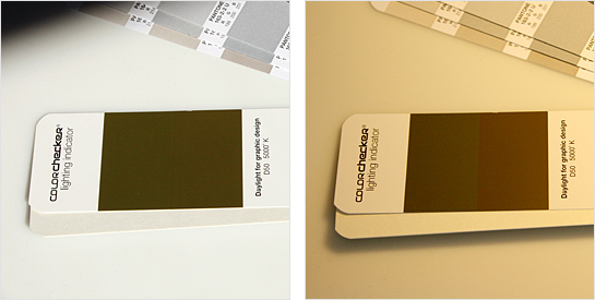
With the Goe swatchbooks themselves, the new color arrangement isn’t a big problem, but it would have been more helpful to see which colors are similar to existing PMS colors. As it stands, there is no easy way to compare similar PMS & Plus colors to Goe, except to view the books side-by-side. Some kind of subtle notation, conversion tool, or documentation would make it much easier to use. However, Goe has made one excellent technical contribution to the line, in the form of the “Color Checker Light Indicator” at the back of the swatchbooks. The checker is a set of 2 colors that look identical in corrected, neutral “daylight”, but color shift apart if viewed under poor lighting conditions that will affect color viewing. This is especially helpful for designers with color-sensitive clients who like to look at proofs and pieces in fluorescent or incandescent lighting conditions.

The Goe system also lets you download the color libraries and myPANTONE palettes for use in the Adobe Creative Suite apps and QuarkXPress. Installation of the libraries is simple enough, just requiring a self-installing download that adds the new Goe palettes to your design apps, without even needing to restart the applications.
The myPANTONE palettes creator is a standalone app for generating color palettes. This application is clearly meant to be a value-add for the Pantone set, but it seems like an unnecessary inclusion. Almost any creative professional worth their salt already has a way of creating palettes that typically revolves around their current applications. Why would you need another application to complicate your workflow? There are also other, more-useful applications like Adobe’s Kuler which has now worked itself into the native Creative Suite applications. Overall, Goe has some interesting characteristics, but nothing that would cause us to abandon PMS and years of experience using the old Pantone system. In that respect, Goe was a failure, though it might have some life in it as a niche product. Pantone seems to think so, and time will tell.
The Future Of Goe
Goe isn’t going anywhere right now, Marra explained. “Goe is still gaining in popularity, and combining the systems, you have a greater range of colors,” he said. “Our experience is that once people get over the hump of trying it, they generally like it. We are still supporting Goe, even though it’s not going to be significant in the market. But there are people who like it, and so we are still supporting it.” To that end, Pantone has also lowered the prices to help speed adoption. “Designers and printers were comfortable with the Pantone Matching System,” he said, reiterating reasons for the birth of Goe. “But we knew we needed to add more colors into the range that people would use. Designers were still wanting more colors.” These insights led directly into the creation of the brand-new Pantone Plus system, which we’ll discuss in our next installment. Stay tuned!
We’d love to here from those of you who’ve had experiences with the Pantone Goe system, so please tell us your stories in the comments below. Thanks!

[...] This post was mentioned on Twitter by Kimberly McGuire and Kimberly McGuire, Hexanine. Hexanine said: Part 1 of our series: A Designer's Guide To Pantone (& what u should know about Goe): http://tinyurl.com/297x7g9 #color #design @myPANTONE [...]
[...] Color My World: A Designer’s Guide To Pantone, Part 1 « Zeroside [...]
[...] Zeroside « Color My World: A Designer’s Guide To Pantone, Part 1 [...]
I was admittedly a little confused and hesitant about Goe, even though I liked the colors I saw. Thanks for shedding some light on the whole thing. Speaking of: the “Color Checker Light Indicator” is brilliant—do they include that in all the books now? They should
Anyways, enjoyed the piece. Thanks!
Thanks for the feedback, Shawn. Yes, now Pantone includes the Color Checker Light Indicator on all the Pantone Plus swatchbooks moving forward.
Great review, but I can’t help but be cynical about anything Pantone has produced recently. Let’s face it, Pantone is just another corporation with shareholders and profits in mind. (Not to mention, they’re a monopoly in the color printing market, making them a necessary evil in my opinion.)
Let’s see…so “after a lot of research” there was no other possible way to get around the deficiencies of PMS than to come up with an entirely new system that requires designers/prepress/printers to purchase all new guides and inks?! Apparently not, because The Plus Series seems to be Pantone’s contingency plan for Goe’s poor adoption. Shame on you, Pantone!
Maybe if we all just replaced our books each year like they want us to, Pantone wouldn’t have felt the need to resort to such an audacious marketing ploy.
led bulbs, led light bulbs, led bulb…
[...]Hexanine | Zeroside[...]…
[...] For a detailed run-down of the history of Pantones, head over to this great post at hexanine.com. [...]
If you are going for finest contents like myself, simply pay a
quick visit this website daily as it presents feature contents,
thanks
Hey daar, simpelweg was op de hoogte vann je website door middel van Google, en kwam erachter dat het echt informatief is.
Ik ben uitkijken voor Brussel.
Ik zal het dankbaar zijn indien je hiermee blijft doorgaan in de toekomst.
Tal van gebruikers zullen voordeel hebben dankzij jouw artikelen.
Dank je wel!