During the research phase of a recent identity project, we spent some time revisiting numerous examples of what we like to call “fluid identities” — logo systems that use multiple iterations of a mark (or series of marks) to communicate a particular aspect of a brand. These might take the form of a logo that changes with each viewing, or a singular mark that gets impregnated with different imagery, depending on the context. At one point, these types of projects were few and far between, but now these isolated examples have grown into a full-blown trend. The days of the static logo are certainly not extinct, but this persistent way of thinking about malleable identities seems like a portend of things to come.
A logo system comprised of many moving parts and contextual styles is clearly not right for every project, and this approach shouldn’t be used carelessly or without deep consideration for the brand connection. Instead, this way of thinking about a fluid identity is another (powerful) tool in the designer’s “bag of tricks.” Like any other design approach (whether it’s a grid style or a Photoshop filter) this is not a gimmick — it’s a way to solve the client’s identity design issues. The examples we’ve collected probably do the best job in explaining the needs and rationales for such a project, so you’ll find them below. We’ve grouped them into categories based on how their mechanics and fluid natures are utilized. We hope this article will serve as a useful resource, so feel free to leave examples we haven’t unearthed in the comments below.
Identities based on the brand’s DNA
Even though they are different, each of the following examples uses some concrete part of their brand’s DNA to populate the fluid nature of the identity.
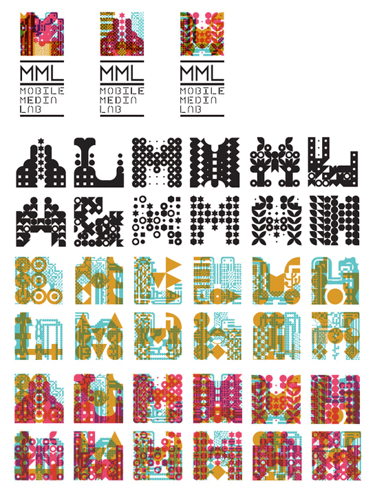
Client: MML Mobile Media Lab
Designers: Etienne Bourque-Viens (Pixel Circus), Raphaël Daudelin (FEED), Michael Longford (York University), Anouk Pennel (FEED)
Description: Echoing the client’s multimedia approach, the identity “is constantly changing and will mutate over time.”
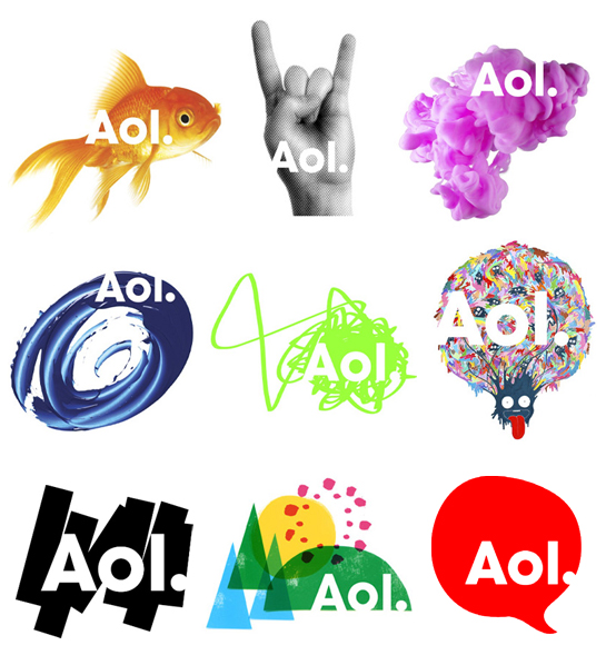
Client: AOL
Designers: Wolff Olins
Description: People use AOL ostensibly as a search engine, to find all sorts of things, so this identity leverages that multiplicity with a wide variety of supporting images.
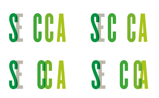
Client: SECCA
Designers: Pentagram
Description:“The final identity conveys a continuing flow; the logo literally moves and fluctuates, echoing the constant change of SECCA’s galleries and community programs.”

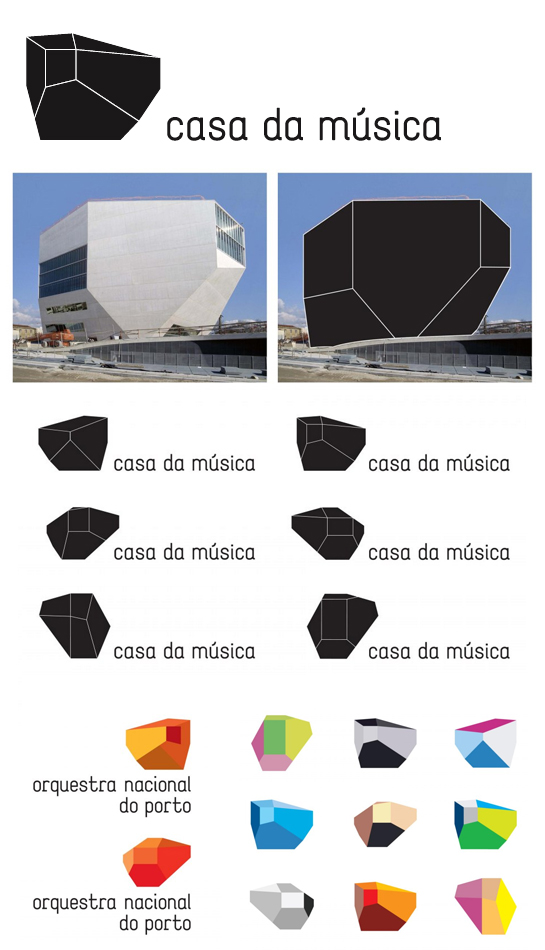
Client: Casa da Música
Designers: Sagmeister
Description: This identity is based upon the shape of the Casa da Música in Portugal, the building designed by Rem Koolhaas.
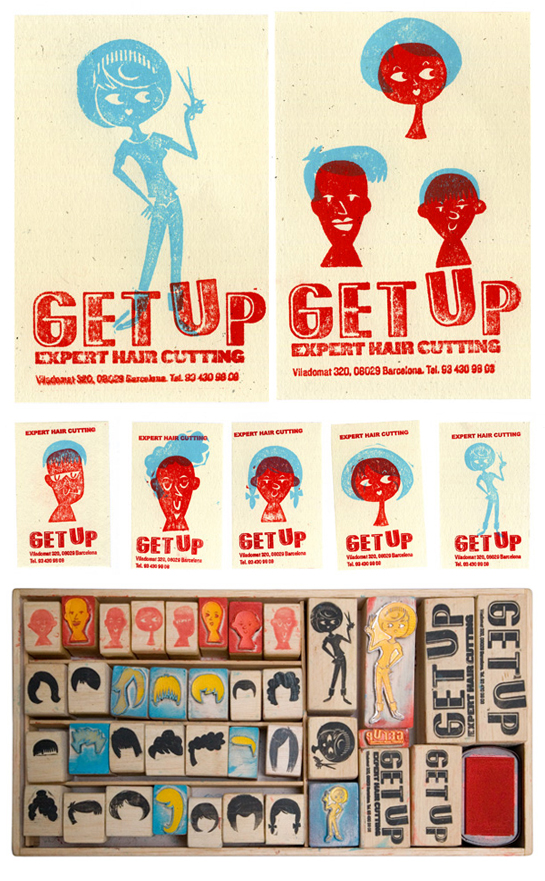
Client: Get Up Hair Identity
Designers: Alexis Rom Estudio
Description: The DIY nature of the stamping process allowed stylists to customize their identity materials in a wide variety of ways.
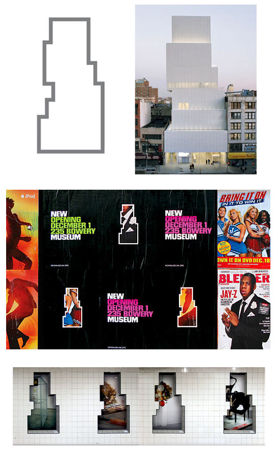
Client: New Museum
Designers: Wolff Olins, Omnivore, Droga 5
Description: The unique shape serves as a containing window to emphasize or deemphasize different graphic elements to great effect. The logo is fluid, with New and Museum serving as ‘bookends’ to frame whatever message is needed between the words.
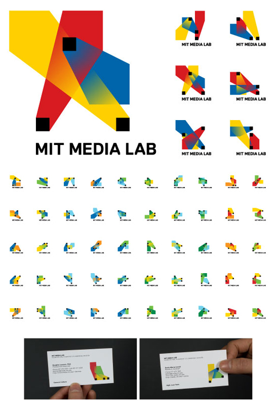
Client: MIT Media Lab
Designers: Richard The, E Roon Kang
Description: “The logo is based on an algorithm that produces a unique logo for each person. A custom web interface was developed to allow each person at the Media Lab to choose and claim their own individual logo for his/her business card, as well as a custom animation software which allows people to create unique animations for any video content the lab produces.”
Identities that morph to fit their design applications
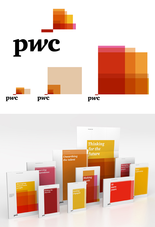
Client: PWC
Designers: Wolff Olins
Description: This scalable identity uses shifting panes of color to adapt and fit any space or medium, using size and scale appropriately and powerfully.
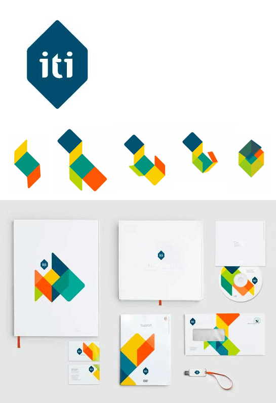
Client: ITI
Designers: Heydays
Description: “The logo can be seen as just a flat artwork, but can also be seen as a cube felt with colors. The multicolored supporting graphic illustrates the logo folded out, and comes in a number of different versions. This communicates both the adaptability of the system, and life taking different directions. Appearing different on every surface, the visual expression is a representation of life, freedom and possibilities.”
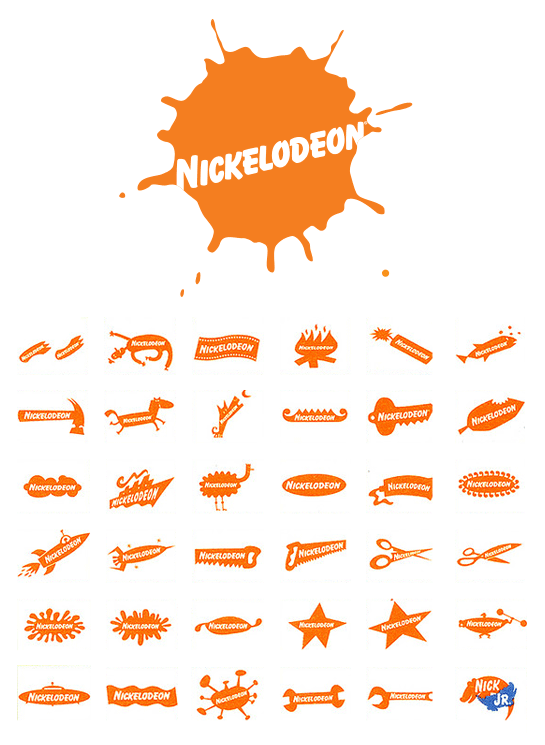
Client: Nickelodeon
Designers: Tom Corey, Scott Nash, Alan Goodman
Description: This whimsical identity was designed with TV screen use in mind, and helped transform the flagging kids’ network, from 1984-2009.
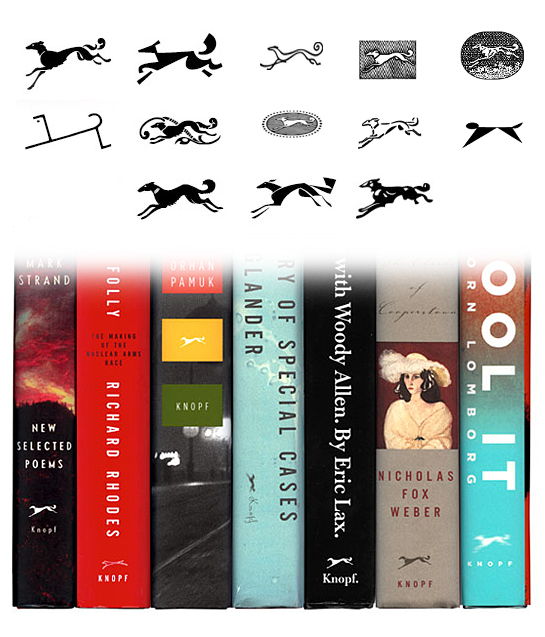
Client: Knopf
Designers: Various
Description: The famous Knopf Borzoi logo changes with nearly each book jacket design, depending on the needs and whims of the jacket designer.
Logos that change based on external variables
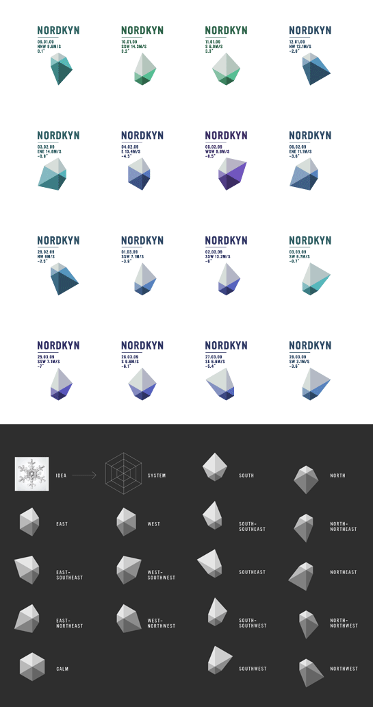
Client: Nordkyn
Designers: Neue Design Studio
Description: “The visual identity is based on two main ingredients; our newly developed payoff, ‘Where nature rules,’ and weather statistics from the Norwegian Meteorological Institute. A feed of weather statistics affects the logo to change when the direction of the wind or the temperature changes. On the website, the logo updates every five minutes.”
Logo enclosures that house value-adding content
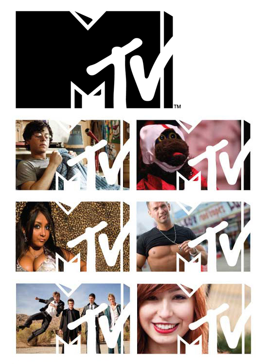
Client: MTV
Designers: MTV In-House Design Team
Description: “We really wanted to see the logo featured in a new way, and this was really meant being able to house all the great things that are happening at MTV at any given time.”
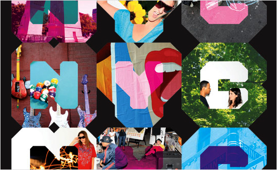
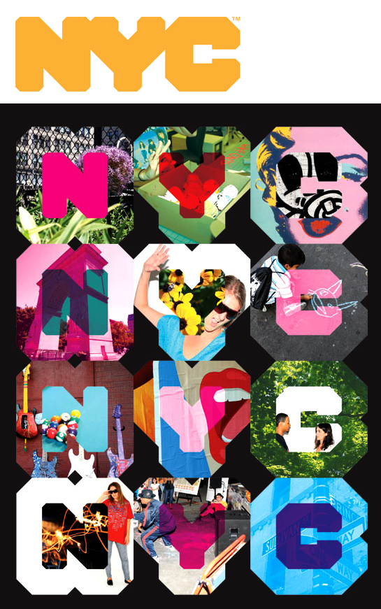
Client: NYC Inc Company
Designers: Wolff Olins
Description: The city’s identity mutates with a grid-like structure and a variety of “fillings,” using color and photo elements to remix the logo in an endless variety of ways.
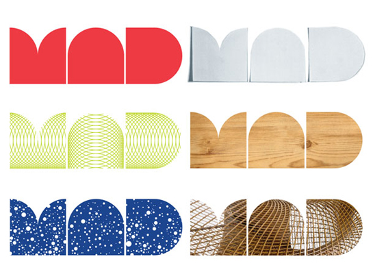
Client: Museum of Arts and Design
Designers: Pentagram
Description: “We wanted a way of writing the name that could embody the values of the Museum, something that seemed inventive and surprising, and that could appear in different ways on different occasions. The Museum, after all, is dedicated to artists who take typical forms—say, vessels, or chairs—and transform them over and over again. We hope that the simple forms of the new logo will permit just that kind of transformation.”
Additional factors to consider before undertaking a fluid identity project:
The pieces need to equal the whole.
Many audiences will never see more than one iteration of the logo system. So, if any individual variant is weaker than a singular logo would be, the overall identity will suffer. Showing 100 variations of a mark might look great in a design case study, but the multiplicity probably won’t matter to your audience — most of them will assume the logo they see is the primary graphical face of the organization. So, all the qualities of a great identity must be present in each and every variation of your mark, which is admittedly a tall order.
Does it fit the brand?
As identity designers, we are always of conscious of helping our clients’ brands stand out. The idea of doing something new or different isn’t insignificant, since our media maelstrom forces brands to do increasingly more to gain visibility. Designing a fluid identity can help bring that needed awareness to an organization, but it shouldn’t be a gimmick at heart. This way of thinking about identity design only works when it’s an outgrowth of the brand’s distinctive DNA – some essential characteristic of the company or organization, whether it’s the nature of change, the style of a building, or illustrating the whimsy needed to play in a specific industry. Some brands might need to show diversity of service or product, while others see flexibility as a crucial competitive advantage, and other organizations have evolution written into their foundations.
Is the system/usage built to support a modularity?
A fluid identity works especially well for Nickelodeon and Knopf, because of the structure the logos exist in. Both companies have flexibility to play with the makeup or look of their logo, but this additional freedom only works because the logos live within rigorous support systems — the Knopf Borzoi always appears on the spine of a book it’s tied to, its size is relatively consistent, and it always shows up in that familiar paperback/hardcover environment. The regular use of media and placement adds a consistency that a pocket folder or Times Square billboard could not. Nick’s identity worked because viewers were guaranteed to see many permutations of the logo per hour on their television screen, preventing any confusion or weakness that the single viewing of one version might cause.
What do normal logos do well? (Maybe you don’t need a fluid logo)
It might be enticing to consider a variable or fluid identity for your client, but before you decide that a changing logo is the ticket, consider making your current mark work harder. Maybe it just needs to be more flexible across applications to have the visceral impact that’s needed. A well-designed, thoughtfully-considered mark can be ready to make the jump from the printed page, to a web version, to an animated intro on the latest iGadget. Good designers have those end requirements in mind before putting pencil to paper, and they stay at the forefront throughout the project duration.
Correction: Additional information about the New Museum identity has been added with help from that project’s director, Suzie Ivelich.
I’m loving this collection of fluid identity pieces. Thanks for putting this together! I love the creativity of Nordkyn – their logo responds to the up-to-the-minute weather, much like their company does. I also found the MIT Media lab striking. They have beautiful color combinations and I love the “individual within a collective” idea. Thanks Tim!
You guys do such an amazing amount of research, thanks for pulling this together! I am def going to mark this to come back to for my next identity project. Looking forward to see what comes next!
Smashing work. Beautiful to look at, fascinating to read, and a joy to behold.
There are no technical rules for designing logos. A good logo is onethat can easily be recorded in our memory and captures ourattention and that should be associated with the company vision.
This is fascinating and really quite exciting. I love the challenge of creating a dynamic visual brand that is still highly recognisable while mutating across a range of logos. Amazing pieces of work!
I think one of the first times I really paid attention to a dynamic logo was when the city of Melbourne unveiled their new look.
http://www.behance.net/gallery/City-of-Melbourne/276451
Nice article Jason! Something cool to consider.
I thought the “fillings” logo concept was cute the first few times I saw it. Slap a picture in there and bam let the image speak for the brand. But shouldn’t the brand speak for itself? Wolff Olins has relied on this so heavily with some of it’s largest clients in the past decade. London 2012, NYC Branding and Aol. I’m almost sick of it now. It’s like they don’t need a designer to come up with a logo, they just need a photographer to take nice pictures…
~J
[...] Great collection of multibrands -via Travis McKinney [...]
Check also the logo of Swisscom, the national telecom company of Switzerland (www.swisscom.ch). It isn’t changing on something, it’s just a moving/3D logo. This re-branding was done 3-4 years ago. They are some funny comments about this logo that I can say here, I let your imagination of what it look on his non animated version
[...] Análisis Logo cambiantes Por: piensologoex / 14, March 2011 / Comentarios (0) Encontramos en ZEROSIDE, un interesantísimo blog sobre Branding, este artículo que nos hace reflexionar acerca de una [...]
I think Priba used to have the first ‘image inside logotype’ in the 1970s. Credit to John Lloyd/AID for being there first – http://www.johnlloyd.uk.com/early_index.php?ident=11&imgid=3&main=1
Also, check out the dynamic identity of MNARTISTS.org. It’s an algorithmic identity, based on the website’s activity. Designed in 2003, Walker Art Center.
http://mnartists.org/
“Decked” is right; I created this variable identity for Priba supermarkets in Belgium in 1973:
http://www.johnlloyd.uk.com/early_index.php?ident=11&imgid=3&main=1
Nice reporting! Note also the article by Roger van den Bergh on Identity Forum, “AOL and dynamic branding: When is it a good idea?”
http://www.identityworks.com/forum/logo-design/aol-and-dynamic-branding-when-is-it-a-good-idea/#more-248
Roger notes also Hadfields, by Wolff Olins in 1967, the Belgian retail chain Priba, Jet Blue livery and the 2004 Brooklyn Museum mark by 2×4. Other examples are added in Comments.
Thanks to everyone for the comments and additional examples — excellent to see John Lloyd’s groundbreaking (1973!) identity as well (thanks for posting personally, John).
Here is another we’ve found, courtesy of David Airey’s LogoDesignLove (http://www.logodesignlove.com):
http://www.mikaelfloysand.com/index.php?/design/deichmanske/
the brazilian telecom provider Oi uses a design system approach like these since 2001:
http://bit.ly/erNUbI
http://www.wolffolins.com/pdf/Oi_Case_Study.pdf
Have you seen the work the Ehrenberg-Bass Institute has done around distinctive assets? I think it would be very useful for your thinking; basically, it’s solid evidence which says you need to cultivate the things people associate with your brand, which might be a colour, shape, song, art style, whatever- as long as it is distinctive, and impossible to confuse with anyone else. It means that you can go right ahead and use a fluid identity, as long as it’s composed of instantly recognisable elements that people tie to your brand.
The danger many of these logos run is that they won’t be recognised as belonging to that company: how many are simply a shape filled with “just like, whatever is relevant”? At least the Nick one would be recognised and attributed to the right brand, even without the word. Hopefully.
I should add, their website is at http://www.marketingscience.info, where there’s a few free articles, but for the meat of the topic, try a copy of How Brands Grow by Byron Sharp: non-affiliate amazon link http://www.amazon.com/How-Brands-Grow-What-Marketers/dp/0195573560
Most logos these days are not following conventional logo standards! is it due to advancement in technology ?…
In addition to Ed, John and Tom’s contributions, I’d add that designers are becoming increasingly aware that their work is able to be easily manipulated and adapted once it passes beyond the boundaries of an organisation thanks to technology. So, yes…
[...] http://www.hexanine.com/zeroside/the-fut… [...]
Great!
Another example Open Ideo http://openideo.com/open/create-an-inspirational-logo-for-openideo/winner-announced/handjob-2-changing-colors/
Well, I think Melbourne would be another great example for this topic.
[...] The Future Is Fluid: Inside Dynamic Logos « Zeroside [...]
[...] To learn more about fluid identities and see other examples, check out this article. [...]
[...] Více v článku The future is fluid: Inside Dynamic logos. [...]
london olympics dates…
[...]Hexanine | Zeroside[...]…
Spielen und bares Geld erlangen, ist hinreißend aber gefahrenträchtig. Beileibe nicht jeder Charakter besitzt die Anfälligkeit dieses Glück ebenso dies Unterfangen zu checken sowie auseinander zu halten. Personen die bereits an einem Spielautomat in der Schänke nicht herum kommen, sollten bei weitem nicht im World Wide Web um Knete gamen. Selbige Leute haben eine Neigung zur Dependenz, schädigen sich selbst noch dazu die Familie. Das ist zugegeben nur selten darüber hinaus kommt einzig bei wenigen Menschen vor. Spielen im Internet um Bares kann auch Freude ausüben. Ein Spieler, der dasjenige kontrollieren kann, hat die Gegebenheit Bares zu gewinnen. Die Auswahl dieser Onlinespiele ist gewaltig. Durchaus muss man berücksichtigen das der Anbieter seriös ist.
check out my blog. I am working on a book on this topic!!!
Like the page, and i will keep you posted!!
https://www.facebook.com/pages/Dynamic-Identities/343110245712721
inspire and be inspired!
[...] ver unos cuantos ejemplos más sobre identidades fluidas en el blog de Zeroside. Share this:TwitterFacebookMe gusta:Me gustaBe the first to like this. Esta entrada fue publicada [...]
[...] The Future Is Fluid: Inside Dynamic Logos – During the research phase of a recent identity project, we spent some time revisiting numerous examples of what we like to call “fluid identities” — logo systems that use multiple iterations of a mark (or series of marks) to communicate a particular aspect of a brand. [...]
[...] other id systems that aren't really algorithmic, but rather dynamic… several examples here: http://www.hexanine.com/zeroside…Embed QuoteComment Loading… • Share • Embed • Just now Add [...]
[...] on http://www.hexanine.com Share this:EmailPrintLinkedInFacebookTwitterTumblrGoogle +1PinterestLike this:LikeBe the first to [...]
Why most of the icon is static instead of animated or interactive? An animated icon will be able to convey more information and more engaging. Why there’s nobody doing it?…
Logo is meant to give an identity to an organization. True that animated/interactive logos can be more engaging but they cannot be used at many places. Most important drawback – they cannot be used in print. Logos are meant to printed on buildings, on …
[...] The Future Is Fluid: Inside Dynamic Logos | Hexanine | Zeroside. [...]
[...] http://www.hexanine.com/zeroside/the-future-is-fluid-inside-dynamic-logos/ [...]
[…] [image source] Handmade dynamic identity: Get Up Printing Kit by Alexis Rom Estudio […]
[…] Museum of Art / Hexanine / Studio […]
You’re so awesome! I do not suppose I’ve truly read through
anything like that before. So great to discover somebody with original thoughts on this subject matter.
Seriously.. many thanks for starting this up. This site is something that is required on the web, someone with a little originality!
Enterprises having a large website with a lot of traffic influx will require the reseller hosting package.
They offer so many extras that make starting up a new website so simple that even a complete novice could get a website
up and running. You can be diligent about protecting your website but someone else on the same server might not be.
We’re a group of volunteers and opening a new scheme
in our community. Your website provided us with valuable info to work on.
You’ve done an impressive job and our whole community will be grateful to you.
Thanks for your short article. I would also love to say that the health insurance specialist also works for the benefit of the actual coordinators of any group insurance cover. The health agent is given an index of benefits searched for by anyone or a group coordinator. Exactly what a broker does is search for individuals or coordinators which often best fit those needs. Then he gifts his suggestions and if both parties agree, the actual broker formulates binding agreement between the 2 parties.
[…] Museum of Art / Hexanine / Studio […]
[…] Museum of Art / Hexanine / Studio […]
[…] Museum of Art / Hexanine / Studio […]
[…] Museum of Art / Hexanine / Studio […]
[…] by Neue: [From Hexanine] “The visual identity is based on two main ingredients; our newly developed payoff, ‘Where […]
Good day I am so happy I found your website, I really found you by mistake, while I was looking on Askjeeve for something else, Nonetheless I am here now and would just like to say cheers for a tremendous post and a all round exciting blog (I also love the theme/design), I don’t have time to read it all at the minute but I have book-marked it and also added your RSS feeds, so when I have time I will be back to read a lot more, Please do keep up the fantastic work.
The root of your writing whilst sounding agreeable initially, did not really work perfectly with me after some time. Somewhere throughout the sentences you were able to make me a believer unfortunately just for a short while. I still have a problem with your leaps in assumptions and you would do nicely to fill in those gaps. In the event that you actually can accomplish that, I could undoubtedly be impressed.
Hello! This post couldn’t be written any better! Reading through this post reminds me of my good old room mate! He always kept talking about this. I will forward this page to him. Fairly certain he will have a good read. Many thanks for sharing!