The Group Typeface Experiment

Last week AIGA Los Angeles hosted The Group Typeface Experiment at TypeCon2010: Babel here in LA. During an unscripted hour of collaborative design, attendees were given the opportunity to create a typeface on the spot using nothing but square and triangle stickers.

I had the pleasure of concepting the event, and the honor of helping produce it, along with numerous other intrepid AIGA LA members including the incredi-awesome Heather Parlato, whose design blog is regular reading here at Hexanine.

We were pretty pleased with the results, revealed here in the video above, filmed and produced on-the-spot by our friends at i am 8-bit (we’re looking at you Taylor Ragsdale). Watch away!
Brand Manifestations: Timbuk2 & Domino’s

As designers of brand identity and strategy, the first part of our work is an excavation into a brand, digging deep to understand what makes that organization great and unique. When we find these nuggets, it’s our job to polish, fashion, and rework them into visuals, strategy and ideas — a cohesive voice for each client. This is challenging and satisfying work that not all designers get to do, so it’s exciting for us to see other examples out in the world — manifestations, if you will, of the nuggets we all search for.

Read on…

Student Spotlight: Tic Tacs Redesign

Here at Hexanine, we are passionate about helping raise up the next generation of designers and design thinkers. This is why, as a firm, we seek to pass along what we’ve learned by teaching, mentoring, and instructing.

We gain at least as much inspiration and encouragement from the work of our students as they receive from our instruction, so we’d like to pass it along by showcasing some of their impressive student projects. Periodically, we’ll highlight great work coming out of our classrooms on this blog.

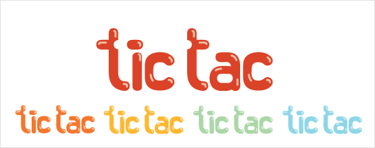
Tic Tac logo redesign

Read on…

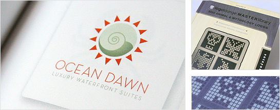
Ocean Dawn logo included in LogoLounge Master Library Volume 2

LogoLoune work includes Ocean Dawn Logo by Hexanine

Our copy of LogoLounge: Master Library, Volume 2: 3000 Animal and Mythology Logos has arrived! Ever a great source of inspiration, research, and insight, this new volume includes our work for Ocean Dawn, an upscale set of oceanfront luxury suites. Thanks to Rockport, Bill Gardner, Catharine Fishel, and the whole LogoLounge team for our inclusion, and for putting out such a great resource.

Jun 28 2010

Comment

A Celebration of Process

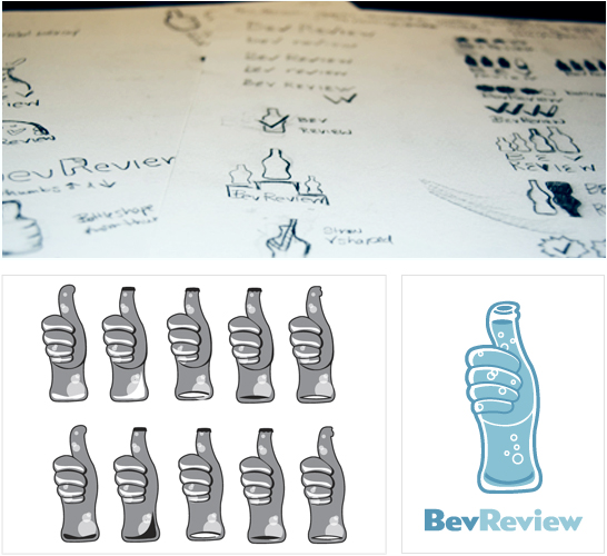
We’re covering a very familiar topic — the design process. We went back and forth answering each other’s questions, describing the process for our last project at Hexanine, a logo for BevReview. Think of it as the teaser before the big reveal of the final design. Brigid and I each took turns asking the other questions, and responding in turn. Read on to find out what our process was and what we learned along the way.

Can you explain the brief for this project?

Chris: BevReview is a beverage blog ran by Steve Tanner. His blog discusses everything from taste and nutrition facts, to the packaging of the drinks. All of the BevReview posts focus on non-alcoholic beverages. Brigid and I took on the task to create a logo that shows BevReview as a fun and credible resource in the beverage industry. The goal was to give BevReview a logo that will stay true to it’s brand.

Would you like to talk about what kind or research we did for the project?

Brigid: I researched the company, industry, and their competitors to find out who they are and their target audience. From our initial meeting with BevReview, I was handed the task of focusing on the concept of rating. So, I began by writing words that could be used to describe or symbolize rating, such as, checks, thumbs up and down, scale, arrows, ranking using bottles or caps, etc.

Read on…

Jun 17 2010

2 Comments

7 reasons why the iPad turns sh** to gold

iPad turns sh** to gold

It’s been hyped as “magic”, “revolutionary” and the potential salvation of the publishing industry. A little thing called the iPad. Yes, it’s beautifully designed by Jonathan Ive. Yes, it’s simple to use. But why do people seem more willing to pay for news, magazines, and content when it’s delivered as an iPad app, when the same basic content has been on the boring, old Internet for years?

Read on…

Jun 9 2010

1 Comment

Chicago Design Week with AIGA

Last week we participated in the first-ever AIGA Chicago Design Week, five days of great events aimed squarely at the Chicago design scene. Crowd-juried design shows, panels, studio walks, art shows and our annual member meeting. It was an amazing whirlwind of events, inspiration, design and celebratory drinks in a great community of creative professionals.

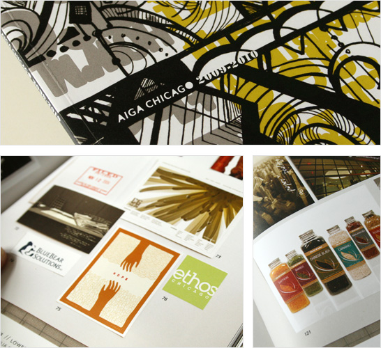
Some of our work was included in the 2009-2010 Snapshot publication, seen below. Can’t wait for next year!

AIGA Snapshot

UPDATE: You can now see the Snapshot in all its glory as a PDF, courtesy of AIGA Chicago.

May 26 2010

Comment

Spreading the message of branding to NPOs

EPIC branding lab
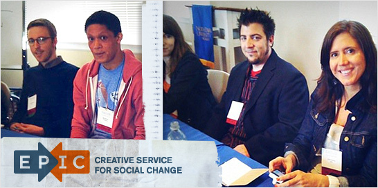
Last week Erin and Tim participated in a panel discussion at North Park University’s 2010 Axelson Center for Nonprofit Management Symposium, to discuss some of the issues nonprofit organizations face in branding themselves. The event was sponsored by EPIC, and Erin (founder of EPIC) moderated a panel of experts from some of Chicago’s best creative agencies and companies, including Gravity Tank, Museum of Contemporary Art, Threadless, Simple Truth, Critical Mass, Synthetic Infatuation, and others. Some of the comments overheard during the Q&A and one-on-one sessions:

“Creating a brand is about trust.” “Branding is who you are, and marketing is what you say to different audiences.”

And finally,

“An organization’s visual language organically comes out of the brand story.”

May 20 2010

Comment