“Products are created in the factory. Brands are created in the mind.” - Walter Landon, founder, Landor Associates
Every organization worth its salt has a logo or visual identity that helps distinguish, identify, or describe its brand to audiences. And if you’ve visited the Internet at any point lately, you can see that everyone has opinions on logos. But when people say “I don’t like it!” or “That’s terrible,” what do they actually mean? There is a deeper question beneath such reflexive comments, though. Honestly, how do you evaluate a logo? How do you know if your company has the next Nike swoosh on its hands, or something much less awesome?
Being identity designers, we’ve seen thousands of logos, and have designed many of them ourselves. It can be tricky evaluating a logo’s strength, because there is more involved than just judging good looks. Below are some considerations, based on the criteria we use to judge our own work at Hexanine. Taken together, all of these put combine to form a useful benchmark for determining if the “front door” of your organization is doing what it should. How does your logo rate in each of the following categories?
1: Differentiation. How well does it stand apart from other logos? Is it unique and memorable — especially when compared to your competition? Or does it get lost among other organizations who share adjacent mindshare or audiences? In an age of constant brand bombardment, the Zag is a crucial ingredient in standing out. For some industries, differentiation might be the difference between market dominance and permanent second-class status.
2: Aesthetics. This is traditionally considered the chief responsibility of designers — and rightly so. Having a visually-strong mark is now the cost of doing business, and organizations who don’t pay attention to the power of beauty do so at their peril. Is your logo well-crafted? Does it employ great symbology and excellent/appropriate typography? Are the visual details of layout, color harmony, and illustration executed at the highest levels? Does your logo scale well and reproduce effectively on a variety of platforms? Clients who come to us for identity design or redesigns typically have beauty atop their wish lists, but it’s only part of the overall brand picture. Visuals are the glue that hold an identity together, but they also work in service of all the other following areas.
3: Conceptual Strength. Differentiation and beauty are not enough. Strong, sophisticated conceptual thinking is what separates logo makers from true brand identity designers. A logo that doesn’t tap into the brand’s ethos and business goals is like a cheap Hollywood set – beautiful to look at, but not strong enough to withstand close scrutiny. How well does your logo echo the brand story? Does it communicate an appropriate metaphor? Does it include necessary chunks of the brand’s essence and heritage? Does it function like a page torn from the larger brand’s tale? Is it correctly aimed at the people and audiences who will draw the most meaning from it?
4: Surprise / Unusual / Aha! Factor. This is that difficult-to-quantify aspect of identity design that causes someone to take a second look, or to dwell on your logo for another moment. That Something Special could be almost anything, as long as it makes sense within the context of your brand. It might be a surprising and unusual combination of symbols, a visual pun, or some hidden element that reveals itself over time. None of this is absolutely required, but it’s certainly icing on the cake of the best identities. This isn’t flash and sizzle, but it’s something that helps an identity remain in the mind, tying itself forever to a set of products, services, or a larger brand.
5: Usage. How well is your logo being used? This seems like it’s outside the purview of logo design, but in truth, some of the most important work is done after a logo is designed. Building a context and visual language around the mark is essential to making sure your overall brand identity is successful. Some visually unimpressive logos benefit from exceptional visual positioning and a proper context that allows them to shine all-the-more brightly. What other visual parts of an overall identity are paired with your logo? Do photography, illustration, original patterns, and imagery add up to help the logo be more than the sum of its parts? Context can become the perfect stage to spotlight the best aspects of a less-than-perfect logo, while also minimizing its weaknesses.
To show how this might work in practice, we’ve rated some well-known logos. Very few corporate identities are going to rate perfect in every category, but the ratings below will show you how well-rounded logos can be successful, and how some brands choose to focus on some aspects at the expense of others.
Nike: Usage makes all the difference
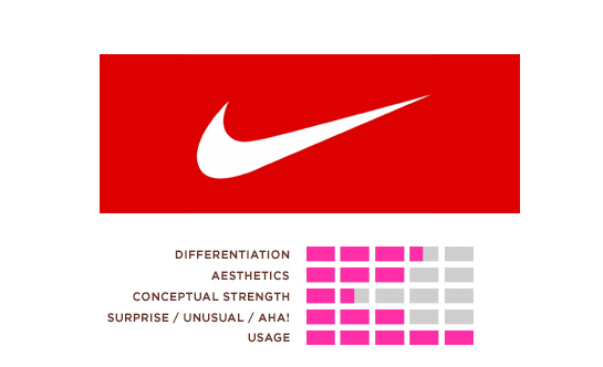
Nike does an amazing job with its very simple logo. But the power of the brand is not in the visual execution of the mark, but in the power of its use. The swoosh has been burned into the brains of billions of people via amazing association with athletes, emotions, and sporting events. Wherever the logo appears, it is always used flawlessly, transcending any issues with the construction of the logo itself.
FedEx: The Godfather of hidden images
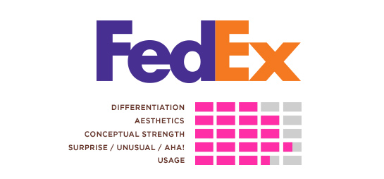
While the FedEx logo seems austere, its simplicity and strength are memorable in themselves. Its unique and varied usage across parts of the company was quite provocative in 1994, and allowed the brand to grow and define itself visually on the canvases of its moving delivery trucks. And of course, there is the infamous hidden arrow.
Microsoft: Simply bland
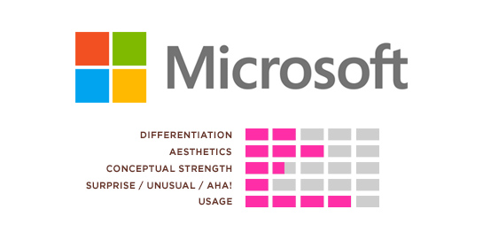
The Microsoft identity is decently-made and generally unremarkable. The mark is very static, and the typography is completely forgettable, which might be an unforgivable sin in the software industry. The brand took a risky move by porting the brand’s most powerful (only?) brand asset — the Windows color palette and iconography — and poured them into a new corporate identity. Simple logos are not always easy to execute, but in this case, simplicity means losing what little personality the original had. This execution is bland, except when used to great success in its motion graphics applications.
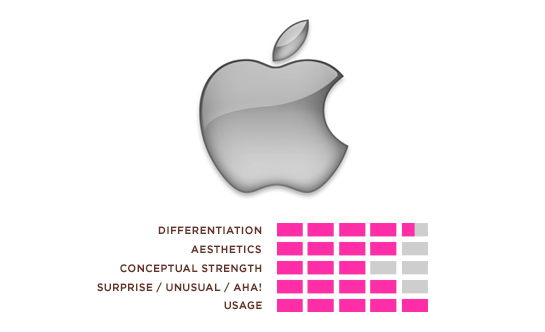
Apple: Cleverness that ages well
Apple’s once-bitten piece of fruit has evolved with the company since its initial rainbow-colored rollout. It has been beveled, liquefied, and stamped on the backs of millions of iPhones and iPads. The original brand story of hidden knowledge (Eve, the Garden of Eden, etc.) has been all-but-lost in its modern incarnations, but the company’s backing with gorgeous, functional product design has only increased. The cleverness of using fruit to sell computers and electronics hasn’t aged a bit.
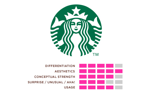
Starbucks: Pouring a tasty cup of omnipresence
This beautiful and transcendent mark is so ubiquitous that it doesn’t need typography. The logo’s application on thousands of street corners and billions of coffee cups doesn’t hurt, but it succeeds not just because of its constant presence in modern living. It endures because of solid coffee and a whimsical mark that stands for a brand experience that has changed modern retail and the way people think about hot beverages forever.
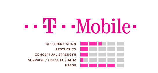
T-Mobile: Not so pretty in pink
Pink (magenta, really) — is the best thing the T-Mobile identity has going for it. The logo is clunky, seems difficult to use, and has far too many moving parts to be considered visually successful. The typography seems inappropriate for the brand, and suggests the fact that T and Mobile are headed towards a visual divorce, slowly drifting apart. But T-Mobile has ended up owning its magenta brand color in such a powerful way, that it barely needs a logo in its communication. Consistent, repetitive, and effective use of the color has allowed the brand to own that bright, cheery magenta in a way not seen since UPS captured Brown. Someone must have been thinking pink.
It’s easy to critique from afar, and every brand his its own idiosyncrasies and issues, but having a solid framework for success in logo and identity design is the first step in making sure it’s not your organization’s logo in the crosshairs.
womens clothing stores
Good, Great, or Hated: How to Rate Your Own Logo « Zeroside
fountain Water pumps
Good, Great, or Hated: How to Rate Your Own Logo « Zeroside
best buy washing machines
Good, Great, or Hated: How to Rate Your Own Logo « Zeroside
rebuilt water pumps
Good, Great, or Hated: How to Rate Your Own Logo « Zeroside
written by http://www.gordonkassen.com
Good, Great, or Hated: How to Rate Your Own Logo « Zeroside
used oled tvs for sale
Good, Great, or Hated: How to Rate Your Own Logo « Zeroside
high cfm leaf blowers
Good, Great, or Hated: How to Rate Your Own Logo « Zeroside
travel tote with wheels
Good, Great, or Hated: How to Rate Your Own Logo « Zeroside
remote flying toys
Good, Great, or Hated: How to Rate Your Own Logo « Zeroside
bestreviews guide legit
Good, Great, or Hated: How to Rate Your Own Logo « Zeroside
Mewtwo Co published a blog post
Good, Great, or Hated: How to Rate Your Own Logo « Zeroside
are oled tvs the best
Good, Great, or Hated: How to Rate Your Own Logo « Zeroside
home depot snow blowers
Good, Great, or Hated: How to Rate Your Own Logo « Zeroside
multiple video capture cards
Good, Great, or Hated: How to Rate Your Own Logo « Zeroside
pets aquatic new hyde park
Good, Great, or Hated: How to Rate Your Own Logo « Zeroside
detail architecture magazine
Good, Great, or Hated: How to Rate Your Own Logo « Zeroside
mens satchel leather
Good, Great, or Hated: How to Rate Your Own Logo « Zeroside
gucci top handle bag
Good, Great, or Hated: How to Rate Your Own Logo « Zeroside
how to clean sex toys
Good, Great, or Hated: How to Rate Your Own Logo « Zeroside
designer top handle bag
Good, Great, or Hated: How to Rate Your Own Logo « Zeroside
best asian movies 2015
Good, Great, or Hated: How to Rate Your Own Logo « Zeroside
chanel flap bag with top handle
Good, Great, or Hated: How to Rate Your Own Logo « Zeroside
chanel handbags 2021
Good, Great, or Hated: How to Rate Your Own Logo « Zeroside
crossbody bags on sale
Good, Great, or Hated: How to Rate Your Own Logo « Zeroside
home depot ego string trimmer
Good, Great, or Hated: How to Rate Your Own Logo « Zeroside
Ego St1502-F Power+ 15″ String Trimmer
Good, Great, or Hated: How to Rate Your Own Logo « Zeroside
ego string trimmer without battery
Good, Great, or Hated: How to Rate Your Own Logo « Zeroside
Leather Travel Tote
Good, Great, or Hated: How to Rate Your Own Logo « Zeroside
ego battery string trimmer
Good, Great, or Hated: How to Rate Your Own Logo « Zeroside
top handle shoulder bag
Good, Great, or Hated: How to Rate Your Own Logo « Zeroside
ego string trimmer strap
Good, Great, or Hated: How to Rate Your Own Logo « Zeroside
crossbody bags leather
Good, Great, or Hated: How to Rate Your Own Logo « Zeroside
ego string trimmer warranty
Good, Great, or Hated: How to Rate Your Own Logo « Zeroside
ego string trimmer parts
Good, Great, or Hated: How to Rate Your Own Logo « Zeroside
Good Chiropractor Near Me In Santa Monica
Good, Great, or Hated: How to Rate Your Own Logo « Zeroside
just click wellnessworldnewsnetwork.ca
Good, Great, or Hated: How to Rate Your Own Logo « Zeroside
makita angle grinder attachments
Good, Great, or Hated: How to Rate Your Own Logo « Zeroside
coach women’s crossbody bags
Good, Great, or Hated: How to Rate Your Own Logo « Zeroside
creative wallpaper periodic table
Good, Great, or Hated: How to Rate Your Own Logo « Zeroside
hatsan break barrel air rifles
Good, Great, or Hated: How to Rate Your Own Logo « Zeroside
best asian romance movies
Good, Great, or Hated: How to Rate Your Own Logo « Zeroside
tapparelle elettriche wifi
Good, Great, or Hated: How to Rate Your Own Logo « Zeroside
interruttore tapparelle elettriche
Good, Great, or Hated: How to Rate Your Own Logo « Zeroside
magnet building tiles
Good, Great, or Hated: How to Rate Your Own Logo « Zeroside
susan medium quilted leather satchel
Good, Great, or Hated: How to Rate Your Own Logo « Zeroside
click the up coming document
Good, Great, or Hated: How to Rate Your Own Logo « Zeroside
michael kors handbags macys
Good, Great, or Hated: How to Rate Your Own Logo « Zeroside
Carta Da Parati Versace 2
Good, Great, or Hated: How to Rate Your Own Logo « Zeroside
You want to make sure you read the fine print so you’re not stuck paying 20% interest, and the same applies to casino bonuses.
tory burch small Walker leather satchel
Good, Great, or Hated: How to Rate Your Own Logo « Zeroside