As designers of brand identity and strategy, the first part of our work is an excavation into a brand, digging deep to understand what makes that organization great and unique. When we find these nuggets, it’s our job to polish, fashion, and rework them into visuals, strategy and ideas — a cohesive voice for each client. This is challenging and satisfying work that not all designers get to do, so it’s exciting for us to see other examples out in the world — manifestations, if you will, of the nuggets we all search for.
“Interviewing Your Client” on Logo Design Love

If you haven’t already found it, check out David Airey’s excellent blog on logos and identity design, Logo Design Love. This week, Tim is featured as a guest contributor with the article, “The Art of Interviewing Your Client”. Check it out, and show David and Tim your love by joining the discussion.
Color My World: A Designer’s Guide To Pantone, Part 1
What is Pantone?
If you’ve ever held color-printed piece in your hands, there’s a good chance you’ve been touched by Pantone. The self-described “authority on color”, Pantone has become an integral part of graphic design and printing, greatly influencing the color of our world. Since 1963, Pantone has been the force behind the printing industry’s color standard, the Pantone Matching System (PMS). PMS is a standardized color reproduction system whereby different manufacturers and printers can accurately reproduce the same set of colors without direct contact with one another. This is significant for brands, because of the importance that consistent color reproduction has on brand identity and packaging. Color plays such a crucial role in brand association that some companies even commission their own colors. (Tiffany’s, well-known for its signature teal blue, actually has its own custom, trademarked Pantone color, PMS 1837.)
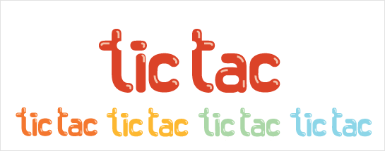
Student Spotlight: Tic Tacs Redesign
Here at Hexanine, we are passionate about helping raise up the next generation of designers and design thinkers. This is why, as a firm, we seek to pass along what we’ve learned by teaching, mentoring, and instructing.
We gain at least as much inspiration and encouragement from the work of our students as they receive from our instruction, so we’d like to pass it along by showcasing some of their impressive student projects. Periodically, we’ll highlight great work coming out of our classrooms on this blog.
Consumers as explorers, and the importance of brand discovery
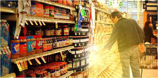
As the recent Tropicana packaging redesign fiasco shows, our perceptions of the products we choose are often made up of much more than the items themselves. But where do these brand perceptions come from, and how are they made? If designers are brand anthropologists, as Erin recently touched on, then consumers should be considered explorers, traversing shelf and window in search of that perfect bottle of tea or pair of shoes. And as in person-to-person interaction, in the branding world, first impressions are everything.
Ocean Dawn logo included in LogoLounge Master Library Volume 2
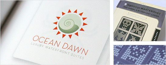
Our copy of LogoLounge: Master Library, Volume 2: 3000 Animal and Mythology Logos has arrived! Ever a great source of inspiration, research, and insight, this new volume includes our work for Ocean Dawn, an upscale set of oceanfront luxury suites. Thanks to Rockport, Bill Gardner, Catharine Fishel, and the whole LogoLounge team for our inclusion, and for putting out such a great resource.
We are all brand anthropologists.
Yesterday we had a parting lunch with our Hexanine interns and Tim and I shared about our own experiences in teaching. One thing I had wished I had brought to the conversation: this notion of brand gap.
What’s brand gap? It’s taking a walk through Macy’s and missing Marshall Field’s. It’s trying to find something quickly at Babies “R” Us. It’s staying at a Westin and having a dirty pillow case. A brand’s identity must culminate at the level where the user experiences the product or service. If this fails, then all of our work in design and branding and marketing is for nothing.
A Celebration of Process
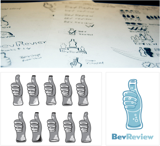
 We’re covering a very familiar topic — the design process. We went back and forth answering each other’s questions, describing the process for our last project at Hexanine, a logo for BevReview. Think of it as the teaser before the big reveal of the final design. Brigid and I each took turns asking the other questions, and responding in turn. Read on to find out what our process was and what we learned along the way.
Can you explain the brief for this project?
Chris: BevReview is a beverage blog ran by Steve Tanner. His blog discusses everything from taste and nutrition facts, to the packaging of the drinks. All of the BevReview posts focus on non-alcoholic beverages. Brigid and I took on the task to create a logo that shows BevReview as a fun and credible resource in the beverage industry. The goal was to give BevReview a logo that will stay true to it’s brand.
Would you like to talk about what kind or research we did for the project?
Brigid: I researched the company, industry, and their competitors to find out who they are and their target audience. From our initial meeting with BevReview, I was handed the task of focusing on the concept of rating. So, I began by writing words that could be used to describe or symbolize rating, such as, checks, thumbs up and down, scale, arrows, ranking using bottles or caps, etc.
7 reasons why the iPad turns sh** to gold

It’s been hyped as “magic”, “revolutionary” and the potential salvation of the publishing industry. A little thing called the iPad. Yes, it’s beautifully designed by Jonathan Ive. Yes, it’s simple to use. But why do people seem more willing to pay for news, magazines, and content when it’s delivered as an iPad app, when the same basic content has been on the boring, old Internet for years?
