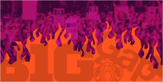
We’re sure this has never happened to you, but sometimes brands misstep and the results aren’t pretty. Whether it’s because of bizarre weather patterns, changing stylistic trends, the rise of American Idol style voting, or slow news cycles, some logos just aren’t well-received. And to be fair, some logos are crappy, objectively. But assuming the work you and your team have launched isn’t a horror show, chances are that it’s decent, solid and professional. But that doesn’t mean everyone will like it. Sometimes the Internet brings the hate.
A Gap In Understanding
By now you’ve heard from many corners of the Internet about Gap’s failed rebranding effort, their response, and eventual recanting. Large corporate rebrandings, their challenges, and failures are nothing new. But the particular way in which Gap presented, backpedaled and reversed leaves our heads spinning. The drama has played out in the blogosphere, on Facebook and in the media. Hopefully Gap has learned something and closed what seems to be a (pardon the pun) gap in the understanding of their own brand.
Read on…